Want to increase conversions, but not sure where to begin?
What if there’s something about your website, landing pages, or marketing emails that is negatively affecting your conversion rate?
Before you can improve your CRO (conversion rate optimization), you first need to figure out what’s wrong. And website A/B testing can help.
Want to learn how A/B testing can help?
Website A/B testing involves comparing the performance of two different versions of a web page, content, design, call-to-action button, or other website elements. It aims to figure out which one of the two options perform better.
It is an effective method for determining which version drives the most conversions. This means that website A/B testing can help you improve your website’s conversion rates.
Table of Contents
What Are the Basics of A/B Testing?
Before you start with website A/B testing (sometimes called split testing), you need to analyze user behavior on your site.
But how?
You can use heat maps and on-page surveys to do this. The goal is to determine what’s stopping your website visitors from converting.
Is your CTA (call-to-action) button visible enough? Is your sign-up form too long?
What could be better?
It could be something entirely different that you didn’t even account for.
Website A/B testing can help you identify these things and form a hypothesis about the changes that may drive more conversions? For example, your hypothesis may be that, “Changing the color of the CTA button will increase conversions.”
The next step is to create a variation (of your landing page, CTA button, etc.) based on your hypothesis. Then you show your original landing page to half the website visitors and the variant to the other half.
How does that matter?
Showing the variant to half of your visitors will help you compare how well it performs against the original. The variation that drives the most conversions is the version you need to implement in your CRO strategy.
In some cases, you may find little or no difference between how well the two variations perform. In which case you’ll need to create a new hypothesis to test and repeat the process until you see a notable difference in performance.
What Should You Test to Improve CRO?
Website A/B testing can help you analyze the performance of pretty much all aspects of your website, emails, and marketing campaigns. However, you probably don’t have the time or budget to test each and every element.
So, what should you do?
You should try testing the elements that are likely to have the biggest impact on your conversions.
Here are 6 aspects you need to look at while doing your website A/B testing:
1. Headlines
Headlines are one of the first things visitors will notice on your site. So your landing page should have a snappy and relevant headline that immediately catches their attention. It should be compelling enough to make visitors want to read more, and eventually convert.
That’s why you can start with testing headline options.
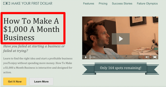
In a BEHAVE (previously WhichTestWon) case study, changing the headline for a business course landing page helped increase conversions by 6.49%.
Here’s the variation that won:
And here’s the other variation:
What made the winning variant stand out?
If you compare the two headlines, you can see that the winning variation includes a specific dollar amount. The headline helps visitors visualize the amount of money they could make per month rather than just making their “first dollar.”
There’s the catch.
You should help your website visitors visualize real results if you want to attract and engage them.
Want some tips to improve your headlines?
Take a look at these:
- Use statistics and numbers to make it more impactful
- Keep it short and precise
- Highlight key user benefits
- Highlight your USP
- Use larger font sizes and more attractive colors for headlines
- Show an achievement or a success story
2. Sales Copy and Product Descriptions
While your headlines should attract visitors, your sales copy should close the sale, which makes it equally important part of your website.
The copy on your home or landing page should inform visitors about the features of your product/service, and how they can benefit from it. It should be educational and enticing at the same time. The same goes for your product descriptions.
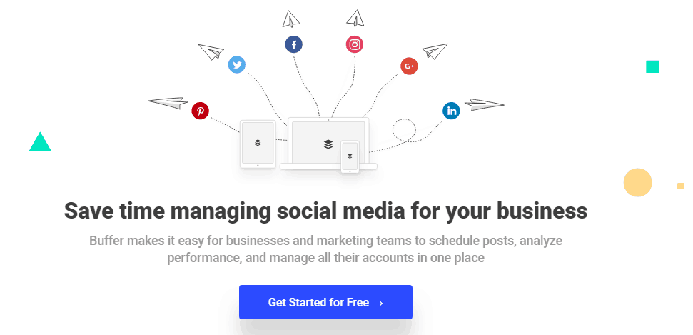
Take a look at how the Buffer homepage is all about the visitor. Instead of talking about what the tool can do, it focuses on what people can do using the tool.
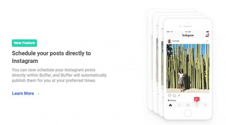
And the description of Buffer’s features isn’t about what the tool does. It’s about how users can benefit from using it.
What should you include in your sales copy and product descriptions?
Here are a few important points that you should remember while finalizing your sales copy:
- Focus on the user, not the product.
- List the product’s features and functionalities clearly.
- Highlight the benefits that users will derive from your product or service.
- State the problem that your product or service will help solve.
- Provide information on all physical aspects of your product like material, dimensions, etc.
- Use bullets and keep the points precise, to make it easy to read.
While doing your website A/B testing, these aspects will help you in deciding what elements you should change to create the different variations.
3. Design and Layout
Your website design may look amazing, but are you sure that it’s not too distracting?
If not, it may be preventing visitors from focusing on the action you want them to take.
Your site design should ideally be clean and minimal, with a focus on the most important elements—like sales copy and CTA. It should also be easy for users to navigate, which means you may also need to build a responsive website to adapt to different devices.
Apply the data from your user behavior tests to build different design and layout variations for website A/B testing.
Let’s say you ran a heatmap test and found that your site visitors are rarely navigating the area where you’ve placed your sign-up form. Then you could test the form in an area where visitors are most active.
For example:
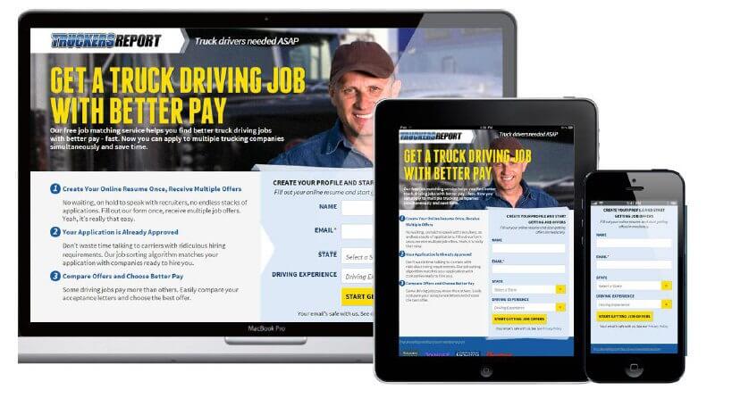
ConversionXL helped Truckers Report execute website A/B testing by changing their landing page’s layout. They realized that the left side of the screen was more active, so they kept their copy there.
They also made some design changes like bigger background images, CTA placement at the bottom, more prominent headline etc. This helped them improve their conversion rate by 79.3%
Here’s what the old website looked like:
And here’s a look at the new website design:
Can you see the difference?
The new version is much more impressive and appealing.
Website A/B testing could not be completed without looking at the design and layout aspects. Try out different layouts and change the placement of various web page elements to see which layout gets you the best conversions.
4. Graphics and Images
Your choice of graphics and images can have a huge impact on your conversions. The purpose of graphics and images is to attract visitors and highlight the benefits of your product/service.
They shouldn’t distract users from the action you want them to take. Instead, they should guide visitors towards the next action. This is why it’s crucial that you include graphics and images in your website A/B testing plan.
Which graphics and images should you pay the maximum attention to?
Maybe the background image on your landing page or homepage isn’t appealing. Or maybe you’re using low-quality product images that don’t display your product’s best features.
Sometimes moving away from a text-heavy format to a more visual format is also needed to improve CRO. GPS Central did this while doing their website A/B testing and saw a 15% increase in revenue.
The best practices for website graphics and images may differ from industry to industry. If you’re selling consumer goods, you’ll need a high-quality image that properly highlights the product and its features. If you’re in the service industry, using images of real people may work in your favor.
Regardless of industry, images shouldn’t just be decorative. They should support your claims and strengthen the desire to buy.
To find out what works best for your website conversion optimization, you’ll need to test different variations of your images or graphics.
For example:
OptinMonster uses fun graphics to illustrate each feature of their tool. Their graphics are engaging and make a huge difference to the page design itself.
What are the best practices for using images on your website?
Here we’ve curated a few points that can help:
- Always use clear, high-quality images.
- Your product images should show your products from different angles and the product dimensions should be clearly visible.
- Include one image showing your products in use.
- You can also use infographics to showcase the various benefits or features of your product or service.
5. Forms
Another crucial element in website A/B testing is your sign-up form. Maybe you want people to sign up for a subscription, or you need them to sign up before completing a purchase. Either way, the form design and copy could have a huge impact on your conversion rate.
How can you optimize your sign-up forms for conversions?
Like images and graphics, there is no foolproof method for optimizing your sign-up forms. So website A/B testing should be included in your conversion rate optimization plan.
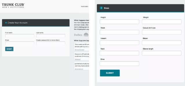
Optimizely conducted a case study on Trunk Club, a subscription service for clothing. The website originally had a simple sign-up form with minimal design.
Here’s what it looked like:
They tested a variation that had more steps than the original, but which also had a stronger visual presentation. The new sign-up process places more focus on each question. And users have to select one of several images to answer the question.
Here’s what the first step looks like:
As you can see in the screenshot above, each image includes a brief description of the style. The new sign-up process is more engaging for users and helped Trunk Club increase conversions by 133%.
Although the popular belief is that short and simple sign-up forms are better, that’s not always the case.
So, does that mean that detailed sign-up forms are better?
No. It all depends on how you execute them, which is why A/B testing your sign-up process and sign-up forms is crucial.
Another thing that you can try is to provide social sign-up options using which users can register using their Facebook or Google accounts. This will reduce the time taken to sign-up and will encourage more people to register.
6. CTAs
Your calls-to-action are one of the most important elements to test for CRO (conversion rate optimization). The tricky part is that there are several aspects to test for your CTA.
Your CTA copy, button color, button size, and button placement all play important roles in your conversions. While doing your website A/B testing, you will have to test all of these CTA elements to improve your conversion rate.
What else matters?
You also need to test your CTA copy as it guides users to take action. Your CTA copy should be short, direct, and actionable. Preferably, it should also focus on what the user is going to get, instead of what you want them to do.
For example, “Get Your Free Guide,” will typically perform better than, “Download Your Free Guide.”
BEHAVE conducted a case study on the two CTA variations shown below. One invites visitors to get a quote, and the other invites them to get pricing.
The first variation outperformed the second, and increased form submissions by 104%. The hypothesis was that since it’s expensive to get water treatment services, the idea of getting a “quote” would be more effective for building trust.
Your CTA copy will greatly depend on what you’re selling or offering. Come up with several variations, and test how each performs.
But that's not all?
Testing other aspects of your call-to-action, such as button size, color, and placement is also necessary for CRO. You should test all of these elements to ensure that your CTA button is prominently displayed.
First of all, your color choice should blend well with the other colors on your page. But it shouldn’t blend so well that it’s difficult for visitors to notice.
What’s the best way to choose the color of your CTA button?
You should choose a color that complements, but contrasts with your main page color. You can then test a few colors to see which one seems to drive the most conversions.
Check out the CTA button below from Olark, for example. The color green instantly stands out so visitors won’t miss it. At the same time, the hue complements the bluish tone of the background.
As for button size, it should be big enough to be noticeable. But it shouldn’t be so big that it overshadows every other element on your site. You can use the data from your user behavior research to determine the best place to put your CTA button.
Want some more expert tips about CTA conversion optimization?
Here’s how you can optimize your CTAs to drive more conversions:
- Use strong verbs encouraging people to take action.
- Use intriguing one-liners that generate curiosity and make people want to know more.
- Use bright, positive colors like green and blue to encourage positive action. In the case of two choices, dissuade people from taking the less-desired action using colors like red that have negative associations.
- Provide two action buttons, both encouraging different positive actions, giving users an illusion of choice.
- Use attention-grabbing, catchy, compelling language in your CTAs.
While doing your website A/B testing, you need to look at all possible variations using these elements, to ensure that your CTAs are optimized for conversions.
Conclusion
These are some of the most effective CRO tips for boosting your conversions with the help of website A/B testing.
However, the number of elements that you can check while doing your website A/B testing is not limited to just these. You can use other elements like typography, colors, videos, etc. while doing your website A/B testing and see what works best for your website.
What’s the first thing you plan to test during your website A/B testing?
Let me know in the comments. And if you need any help driving more conversions, make sure you get in touch with me.






![41 best tools for building a profitable sales funnel in [year] 25 41 best tools for building a profitable sales funnel in 2021](https://shanebarker.com/wp-content/uploads/2020/08/41-Best-Tools-for-Building-a-Profitable-Sales-Funnel-in-2021.jpg)
![top 37 cro tools (free & paid) you need to try in [year] 26 top 37 cro tools (free & paid) you need to try](https://shanebarker.com/wp-content/uploads/2018/02/Top-37-CRO-Tools-Free-_-Paid-You-Need-to-Try.jpg)


Great post! I’m certain I can implement a few of the techniques you’ve listed, and figure out what campaigns work best for me.
Thanks for the informative blog post about A/B testing.
I am so grateful for your blog. Really looking forward to reading more. Really Great!.
I’m so glad you liked my post about A/B testing interesting. Keep visiting for more such information.